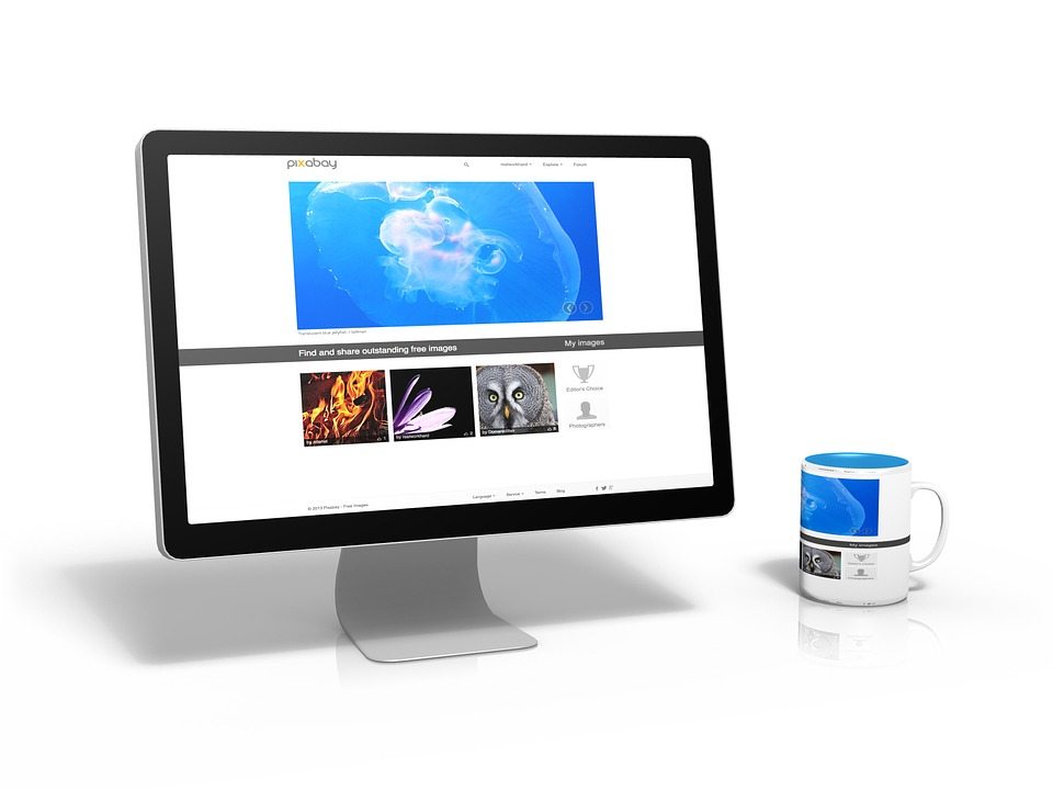
An Effective Website is the KEY to Digital Marketing Success
An effective website in Adelaide relies on good user experience design. While ten years ago we may have sat patiently for a page to load, or awkwardly scrolled through a non-optimised site on our phones, or clicked on every page of a site to find the information we were looking for, the reality is that today’s visitor will not put up with poor design. We expect everything we want to be at our fingertips at the click of a link. We expect clean, sleek, easy to navigate sites that give us concise information without us having to dig.
Mobile Optimisation
When the expectations are so high, it’s almost a shock to be confronted with a less than worthy site. Yet more than 95% of people have come across a site that wasn’t mobile optimised over the past year. From that point, 79% will immediately search for another site that is easier to use. It’s not just formatting going AWOL either. Good mobile optimisation, and good UX design, considers the user at all times. A contact number listed should always be enabled with click-to-dial functionality. Similarly, locations should open in maps applications. Think about how you would visit your site on your mobile, and little shortcuts that would make your visitor’s life easier. But it’s not just optimisation that people so often forget about.
Navigation
The best websites have endless strategic thinking and marketing insight poured into them, yet the average visitor would never know. This is because the key to good design is to not notice it. You may not even realise that you are following a purchasing journey, clicking tabs from left to right as you introduce yourself to the business, read about their services, perhaps get a little boost in confidence from some client testimonials and then convince yourself that this is the product for you, landing on their contact page. Fluid, intuitive navigation works like a well-oiled machine. While you’re in the build stage, talk to experts in Adelaide website design.
Content
No one in their right mind is going to read slabs and slabs of content. We don’t want an essay. We want the easy way out; just tell us what we want to know and forget all the other stuff. When it comes to content on your site, visual appeal is just as important as what you actually have to say. Short paragraphs, lots of images or even better, video, will keep your viewer interested for longer. You have to endlessly compete for your viewer’s attention. If they’d rather be on Netflix, it’s only a click away. You have to focus on continually enticing them to stay. They are your guest, and you are the host.
Ultimately, in today’s age, a website that is not user friendly will have high bounce rates, low page per visit results and likely not result in the conversions you are after. What’s worse, is that it’s not just the visitors who won’t be interested. Google will actually punish you too for having poor design, so it’s harder to get your visitors in the first place. Lay the foundations for a good digital marketing campaign in Adelaide with a beautifully structured website.
Also Read:
What Makes Us the Best SEO Company in Melbourne?
What You’ll Get When You Hire the Leading SEO Company in Melbourne?


